Why Your Latte Art Looks Wrong on Matcha — And How to Fix It
You've been practising your latte art on espresso drinks and it's finally starting to come together. Hearts are clean, tulips are stacking nicely. So you try it on a matcha latte — and suddenly everything falls apart. The shape blurs, the contrast disappears, and the milk seems to sink straight into the green.
Sound familiar? You're not alone — and the good news is it's not your technique. Matcha behaves completely differently from espresso, and once you understand why, your next matcha pour will look noticeably better.
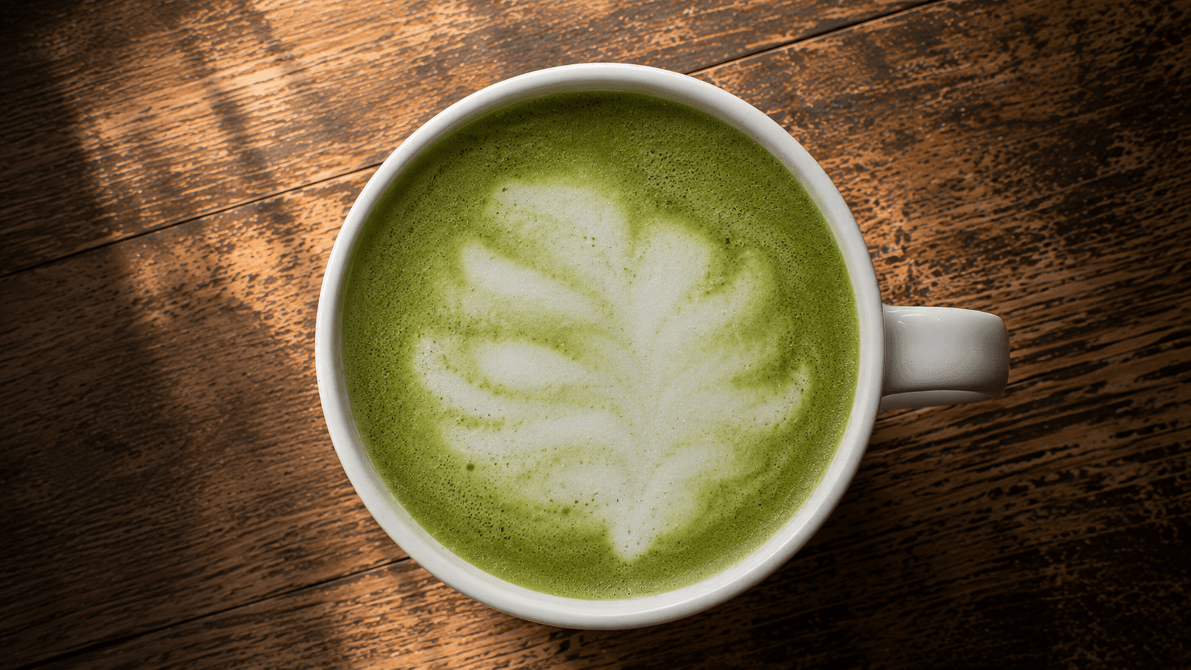
The Matcha Surface Has Micro Bubbles
This is the first thing that catches baristas off guard. Espresso has a dense, smooth crema that gives you a clean canvas to pour onto. Matcha, on the other hand, naturally develops micro bubbles when whisked — and those tiny bubbles break up the surface, making clean edges almost impossible to achieve.
If your latte art looks fuzzy or undefined on matcha, this is almost always the culprit — and it happens before you even start pouring.
The fix: It starts before the cup. Sift the matcha powder first to break up clumps, and whisk in a brisk "W" or "M" motion rather than a circular swirl — that disperses the powder with less trapped air and leaves a smoother, more uniform surface. Then give the cup a few firm taps on the counter (2–4 is usually enough) and a slow swirl to settle any remaining bubbles. If you've whisked vigorously, let it rest for 20–30 seconds before pouring. The calmer the surface, the cleaner your shapes will be.
Brew · Brew's definition score picks up surface quality immediately — fuzzy or broken edges on a matcha pour are a direct sign the surface needed more settling time before the pour.
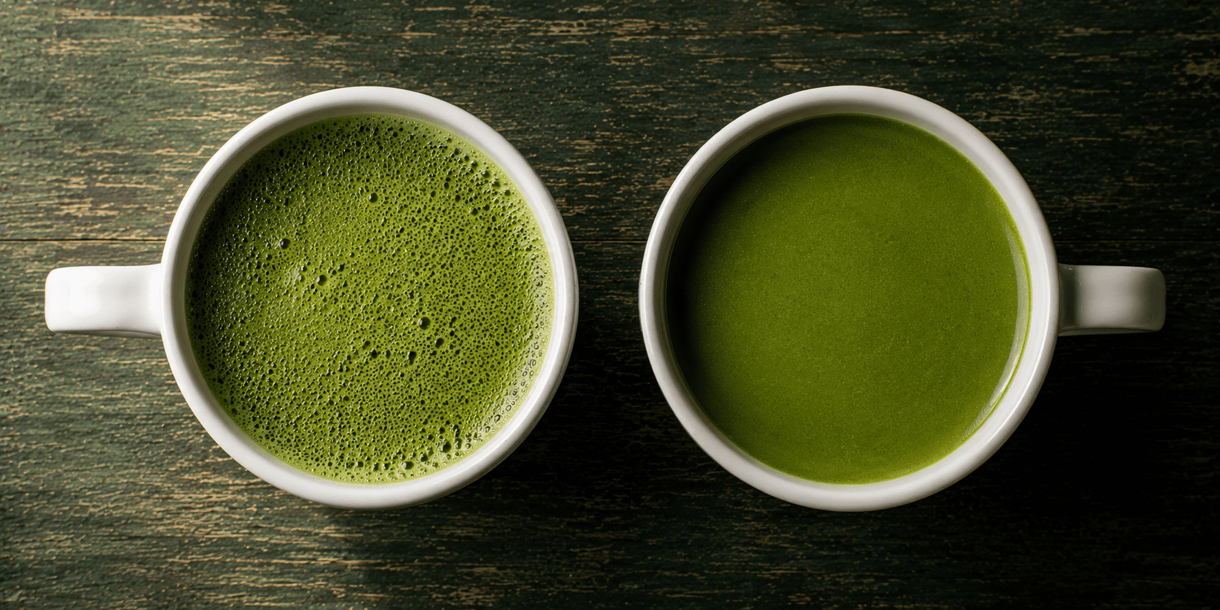
The Green Canvas Kills Your Contrast
On an espresso drink, the contrast between deep brown crema and white milk foam is what makes latte art visible and striking. On matcha, that contrast disappears — green and white are simply much closer in tone than brown and white, making even a technically perfect pour look washed out and hard to read.
Most baristas assume their pour went wrong when actually the issue is purely visual — the shape is there, it's just invisible against the green background.
The fix: Two things help dramatically. First, make your matcha slightly darker and more concentrated — a deeper green creates more contrast with the white milk. Second, steam your milk to be as bright white and glossy as possible — avoid any hint of beige or tan in your foam, which further reduces contrast. The combination of darker matcha and whiter milk is what makes matcha latte art pop.
Brew · Brew's contrast score measures this directly — a low contrast score on a matcha pour almost always means either the matcha is too pale or the milk isn't white enough.

The Milk Sinks Instead of Floating
This is the most technically challenging aspect of matcha latte art — and the one most baristas don't expect. It's tempting to assume the milk sinks because matcha is "lighter" than espresso, but that's not really it: a matcha base and steamed milk are actually fairly close in density. The real difference is the surface. An espresso shot is topped with crema — a stable, slightly viscous layer of emulsified oils and carbon dioxide — and that crema gives the milk something to catch on and float across. Matcha has no crema. With nothing to sit on, the milk punches straight through the surface and blends into the drink unless you pour with real control.
The result is a pour that looks fine leaving the pitcher but produces no visible shape in the cup — the milk simply disappears into the green.
The fix: Everything needs to be more controlled than you're used to. Pour lower — keep the pitcher spout almost touching the surface to minimise the force of the pour. Pour slower — a gentle, steady stream gives the milk a chance to sit on top rather than punch through. And start your pour in the centre of the cup where the matcha is deepest, giving the milk the best chance to float.
Brew · Brew's definition score reflects this — a matcha pour with soft, undefined shapes is almost always a pour height and speed issue rather than a technique problem.
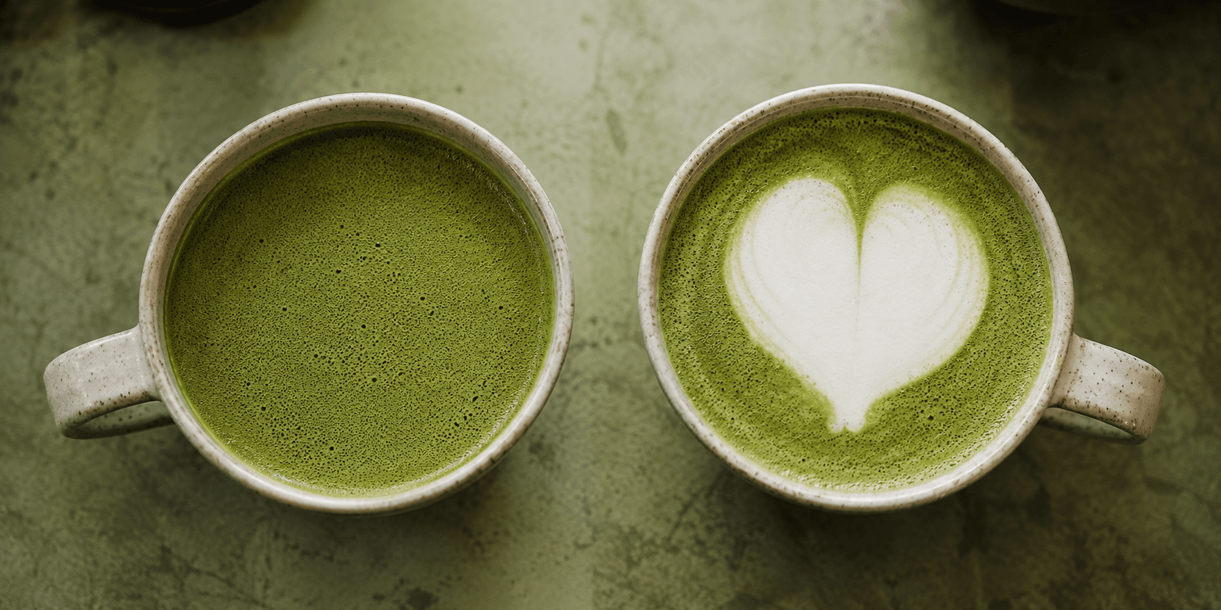
Same Skills, Different Canvas
Your technique doesn't need to change for matcha — just your understanding of the material. The same heart, tulip, or rosetta you've been practising transfers directly once you account for the surface, the contrast, and the pour weight. And the best way to know which of the three is holding you back? Get scored on the actual pour — Brew tells you exactly where it went wrong, with one specific fix to try next.
Try Brew free — a pour every day, no card →